Design comparison
Solution retrospective
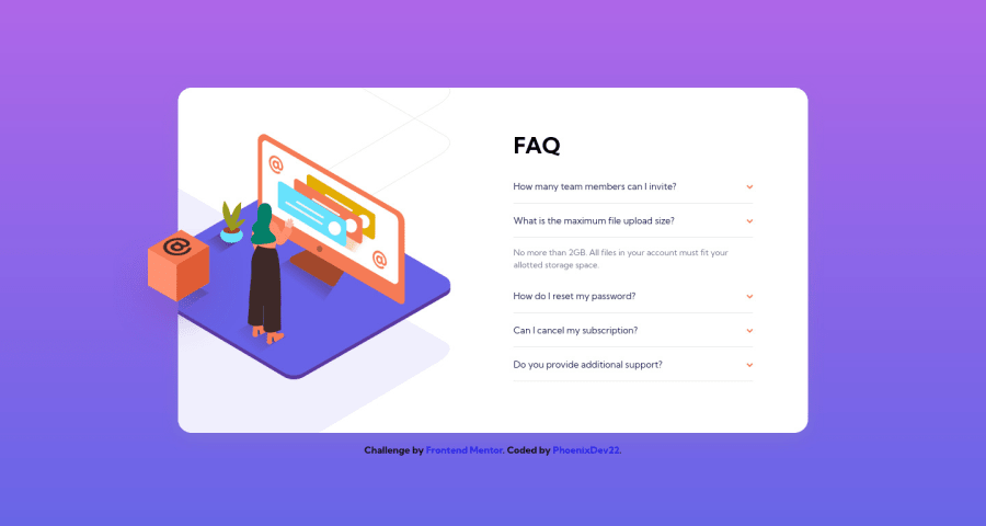
Hello community, In this challenge , I have used another way to make accessible accordion buttons, headers and ARIA attributes combination.
- Using JavaScript to close the opened accordion when opening another one.
- The user is able to navigate using the keyboard.
If thereβs anything you suggest to improve or missed, please donβt hesitate and leave a comment. Thanks in advance
Community feedback
- @ApplePieGiraffePosted over 2 years ago
Greetings, PhoenixDev22! π
Good work on this challenge! π You've done a nice job in making this component interactive and it's great that you've been thinking about accessibility! π
You might already be aware of this, but you can use the native HTML
details
andsummary
elements to quite easily make interactive accordions that are fairly accessible! They might make your life a little easier the next time you create a component similar to this. πIf you're interested in learning more about those tags, check out this page from MDN. π
Hope this helps. π
Keep coding (and happy coding, too)! π
Marked as helpful3@PhoenixDev22Posted over 2 years ago@ApplePieGiraffe Yes , I was aware of the
summary
anddetails
elements as Iβve used them in Bookmark landing page. I tried to use a different approach to make the accordion accessible with the use of some ARIA attributes and some JavaScript. And of course , usingsummary
anddetails
is much easier. Thanks again for checking my solution and providing a helpful feedback.1@ApplePieGiraffePosted over 2 years ago@PhoenixDev22
No problem! π That's great to hear!
0
Please log in to post a comment
Log in with GitHubJoin our Discord community
Join thousands of Frontend Mentor community members taking the challenges, sharing resources, helping each other, and chatting about all things front-end!
Join our Discord