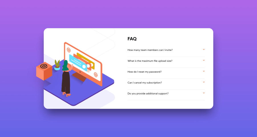
Design comparison
Solution retrospective
Im starting to practice again with HTML/CSS. I just dont know if i did a good job with the images. Can someone check ".hero" and ".hero-shadow" classes, inside of container, and suggest me a better way of positioning the images?
Community feedback
- @grace-snowPosted about 4 years ago
Hi Felix, As others have suggested, take another pass at your html structure. It's not using the right elements at the moment. For example, your containers around eahh faq should be
<li>s, which are the only valid children Inside a list (spans would also be invalid)If you wrap the question in a button element it will gain interactivity by default. An accessible pattern would be something like
<h2 class="faq_heading"><button type="button" class="faq_btn"><span class="faq_question">Question here</span> <span class="faq_icon">image here with empty alt attribute</span></...I hope that makes sense! 😂
Similarly, you don't need the question answer to be in another list. It's a standalone answer, the only item, so should probably be in a
<p>tag (or a div with a paragraph tag inside it)The other tiny thing I notice is your background isn't stretching as the content expands on mobile. I think you have a height 100vh on it? Changing to
min-heightwill fix that and allow it to grow when needed.That all said, you've done lots brilliantly on this solution, so don't be discouraged! I particularly like the arrow animation on click, the layout looks spot on (I'm viewing on mobile), really good to see you've wrapped js in a dom content loaded check, and I like the BEM naming I can see.
So keep going, you're learning well 👍
2 - @ApplePieGiraffePosted about 4 years ago
Hey, Felix Anducho! 👋
Yes, good effort on this challenge! 👍
I'd also like to suggest you take a look at your solution report. Adding some
altattributes to your images and replacing some of your<div>s with<span>s should clear up most of the errors on your solution report. 😉Keep coding (and happy coding, too)! 😁
1@PleopleqPosted about 4 years agoHey @ApplePieGiraffe !
I always forget the alt attributes haha. And totally forgot about <span> :( thanks again for your time.
Have a great day!
0 - @artimysPosted about 4 years ago
Hi Felix, good attempt at the challenge. 👍👍 I can provide some suggestions to your method. Now that you have completed the challenge I also encourage looking at other solutions in the community and check out their method. You'll see many different ways.
For mobile images: I recommend putting
.heroand.hero-shadowin a new container so that they are self contained. Try.hero-shadowas a background-image and leave.heroas image tag. Play with styling after.For desktop images: I made a codepen snippet to kind of show how I went about it instead of writing a novel here.
-- feedback:
- add a
max-widthto your container - nice effect on the answer
- for accessibility reasons, add a hover state and cursor to the question
--
Hope it helps and keep on coding!!
1@PleopleqPosted about 4 years agoHi @artimys, your solutions makes more sense that the "thing" i did. Your answer really helped me, because i always struggle with these kind of layouts.
Thanks so much for taking the time of making that codepen!
Have a great day/evening/night!
0 - add a
Please log in to post a comment
Log in with GitHubJoin our Discord community
Join thousands of Frontend Mentor community members taking the challenges, sharing resources, helping each other, and chatting about all things front-end!
Join our Discord
