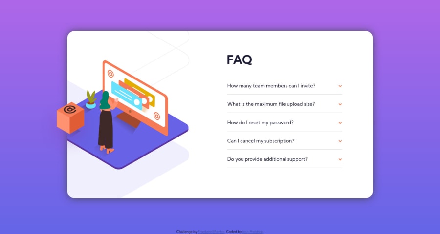
FAQ Accordion Card - HTML/CSS - Flexbox - JS
Design comparison
Solution retrospective
I feel like I am getting more comfortable with JS but at the same time not at all haha I am happy with the results I was able to get but I'm not sure if my script is efficient or not. I did notice that to get each answer to drop down for the first time, you have to double click, but a single click will open/close after the initial drop down. Would love some pointers there!
I also feel like some of the positioning choices I made are a little questionable. I would have really liked if I could have gotten the answers to drop down without shifting the entire list both up and down. Having the top question in a fixed position and all the answers shifting downward would have been choice. To mitigate on overflow, I used js to ensure only one answer could dropdown at a time, selecting a different question would close the currently opened answer. I was also trying to find a way to slow the display transition for the answer divs but was unable to figure out a way.
Any tips/tricks/pointers/critiques are welcome and greatly appreciated!
Thanks for looking!
Community feedback
- @ApplePieGiraffePosted about 4 years ago
Hey, Josh Prentice! š
Great work on this challenge! š
In addition to all of the wonderful feedback you've already received, I just wanted to let you know you can use the HTML
<details>
and<summary>
elements to easily make an accordion without any JS! I was pretty happy when I found out about it and you might be able to use it in a future challenge, too, if you'd like!Here's some more info, if you're interested.
Happy coding! š
1 - @SarsiPCPosted about 4 years ago
Good work, boss! I was doing this solution myself as well and had a really hard time with javascript. After trying out other user's code, I have found that your javascript code was the cleanest and it was easy for me to understand. So, I decided to use it on my solution. You should check it out!
Thanks!!!
1@jfprenticePosted about 4 years ago@SarsiPC thanks! the JS on this gave me a little trouble too, I'm glad my code helped you out! I did find a solution to the issue I had with needing to double click for the initial drop down - in the first for loop, I added an OR to the first if statement, if ((answers.item(i).style.display === 'none') || (answers.item(i).style.display === '')) The style.display looks for an inline styling and since there isn't one set the style.display==='' is necessary.
1@SarsiPCPosted about 4 years ago@jfprentice Hey man. Removing the
display: none;
in the CSS and moving it over to the answer divs inside the index.html fixed this issue for me!<div class="answer-div" style="display:none;">
1 - @emestabilloPosted about 4 years ago
Hey Josh, great work as always! Grace has already given a lot of awesome pointers. Here's a SO post about your JS question. It seems it is looking for the inline style that was initially set on the document with the first click. None was written so it takes an extra click for the styles on your JS file to be applied.
1@jfprenticePosted about 4 years ago@emestabillo you're definitely right, I think I can make a work around for it. Thanks for checking out my work! You're definitely a dependable mentor! :D
1 - @grace-snowPosted about 4 years ago
Some really nice work here. I've finished for the day so only had a quick peek on my phone. Mobile design looks great and I can understand all your code well.
A few small things to think more about:
- with accordions / collapsible sections users are meant to be able to open more than one at a time. Otherwise they'd be tabs (just vertical ones) . And with display none being used I'd have to check if these were still accessible with assistive technology.
- personally I don't like click events being placed on non semantic html elements. I would always use a button for this kind of UI (or radio inputs for tab behaviour) so you get all the native interactive behaviour by default.
- there should probably be aria attributes used to make it clear what's expanded and what's not
- and I'd have each faq in a list item I think
Hopefully that's helpful ideas for where to go with it.
I haven't looked at position/double-click/layout stuff you've asked about but could maybe take a look tomorrow when I'm on my laptop again.
Good job though, it definitely all works and looks nice on my phone
1@jfprenticePosted about 4 years ago@grace-snow thank you so much! I wasn't really sure how an accordian section was supposed to be so I just went with what I thought was best. The issue of using the divs instead of buttons didn't even occur to me and to be honest I had never heard of aria attributes until I read your comment! I have a lot to learn still. I really appreciate you taking the time to look at my work!
1
Please log in to post a comment
Log in with GitHubJoin our Discord community
Join thousands of Frontend Mentor community members taking the challenges, sharing resources, helping each other, and chatting about all things front-end!
Join our Discord