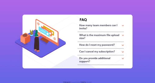
Submitted over 4 years agoA solution to the FAQ accordion card challenge
Faq Accordion Card/ HTML5/ CSS3/JAVASCRIPT
@Yohanr19

Solution retrospective
I could not find a way to make the woman image crop out at the end of the card background, i would gladly take any help. Also i am still struggling to make it look good on devices whit lower resolution.
Code
Loading...
Please log in to post a comment
Log in with GitHubCommunity feedback
No feedback yet. Be the first to give feedback on Yohan Reyes's solution.
Join our Discord community
Join thousands of Frontend Mentor community members taking the challenges, sharing resources, helping each other, and chatting about all things front-end!
Join our Discord