Design comparison
Solution retrospective
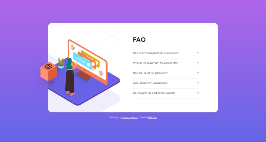
If you click on a panel that has a content of 3 or more lines, you will find that the overall height of said content is insufficient. Thus, there is not enough spacing between the content and the bottom-border line, creating an awkward look. Currently, the height of the panel is "hardcoded." How do I make it flexible or responsive to the height of text without hardcoding the amount in pxs? I already tried a height value of auto, but by doing so the panel does not animate open/close anymore as auto is not a valid way to transition.
This was my second attempt and things look better in terms of layout. Overall, I'm proud of this one.
Community feedback
Please log in to post a comment
Log in with GitHubJoin our Discord community
Join thousands of Frontend Mentor community members taking the challenges, sharing resources, helping each other, and chatting about all things front-end!
Join our Discord
