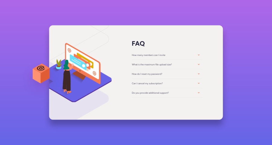
Design comparison
Solution retrospective
Threw the towel on this one. I guess I can say it's partially working. This solution is based on the CSS Online Accordion Slider Generator which uses checkboxes and negative margins to move elements up and down. There's some overflow issue beginning at around 475px which I was not able pinpoint and also clipping content below 335px. I probably made this much more complicated than it needed to be and doing this using JavaScript may be the simpler approach. Less moving parts to keep track off. Don't have the steam to solve these issues right now. I'll probably give this another shot some another time.
Community feedback
- @AdrianoEscarabotePosted about 2 years ago
Hi dupakarovsky, how are you?
I really liked the result of your project, but I have some tips that I think you will enjoy:
- To improve the accessibility of the project you could have put an h1. Every page must contain a level 1 header, for people who use screen readers, identity what the main title is.
- images must have alt text unless it is a decorative image, for any decorative image each IMG tag must have empty
alt=""and addaria-hidden="true"attributes to make all the assistive technologies of the Web, as screen reader. Learn the differences between decorative/meaningless images vs important content.
The rest is great!
I hope it helps... 👍
0
Please log in to post a comment
Log in with GitHubJoin our Discord community
Join thousands of Frontend Mentor community members taking the challenges, sharing resources, helping each other, and chatting about all things front-end!
Join our Discord
