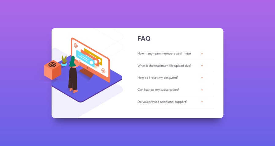
Design comparison
Solution retrospective
It was challenging getting the images correctly stacked together. I deciced to use css instead of js for the effects on the card. Not too happy with the end result so any advice would be much appreciated.
Community feedback
- @rsrclabPosted almost 3 years ago
Hi, @chintriago ~
Congratulate on your solution to the challenge on FM platform. I have studied your work carefully and learned a lot from it.
Here are some of the tips I like to provide.
- I noticed box image goes far from faq box on wider screens. I think that's because you set position using left.
- I think you can try transition on faq items.
https://www.frontendmentor.io/solutions/faq-component-PVa_spYOL
Here is my solution to this challenge, and if it can help you even a bit, it would be happy to me.
Cheers ~
Marked as helpful1@chintriagoPosted almost 3 years ago@tymren608 thansk alot for the advice! Yeah was hoping to find a solution to make the faq box just stay in place but couldn't. I liked the animations on your solution. definitely need to learn those.
0 - @dwhensonPosted almost 3 years ago
Hey @chintriago nice one with this tricky challenge! π
I also really struggled with the image positioning on this one, and I'm not sure I ever really got it sorted!
For the actual FAQ section of the page, One thing that really helped me with this one was the use of the details and summary HTML elements. These have much of the functionality baked in and can be styled with a little bit CSS work. This also has the advantage of including keyboard functionality and allow the key elements to be focusable automatically.
If you went with this approach you can also animate the opening and closing pretty simply using some code like:
details[open] summary ~ * { animation: sweep 0.2s ease-out; will-change: opacity, transform; } @keyframes sweep { 0% { opacity: 0; transform: translateY(-1em); } 100% { opacity: 1; transform: translateY(0); } }
The styling of these elements can seem a bit complicated at first, but there are some good resources out there. The page is a bit of a mess but I have found the following page to be a pretty good guide in how to style things, including the triangle indicator: https://webdesign.tutsplus.com/tutorials/explaining-the-details-and-summary-elements--cms-21999
I think using this would help simplify that side of things.
Hope this helps a bit and good luck!
Cheers π
Dave
Marked as helpful1@chintriagoPosted almost 3 years ago@dwhenson Hey dave appreciate your help! I've never heard of the details and summary elements but will check it out thanks alot and cheers to you as well :)
1
Please log in to post a comment
Log in with GitHubJoin our Discord community
Join thousands of Frontend Mentor community members taking the challenges, sharing resources, helping each other, and chatting about all things front-end!
Join our Discord