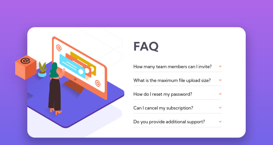
Design comparison
Solution retrospective
Hello everyone!
I started this project before the New Year's Eve (December 26th), then I took a vacation and only today I came back to finish it, so it was a little bit hard to remember all the problems that I needed to fix and where I had stopped.
For me, to manipulate the images in desktop layout was one of the hardest challenges for me until now. I tried many times until the images go to the place that I wanted them to go.
I didn't manage to change the size of the <hr/> line, I wish it was thinner.
Other thing that I wasn't able to do, was to cut part of the images when the card ends.
So, if someone knows how to correct this problems, feel free to give me some tips!
Community feedback
Please log in to post a comment
Log in with GitHubJoin our Discord community
Join thousands of Frontend Mentor community members taking the challenges, sharing resources, helping each other, and chatting about all things front-end!
Join our Discord
