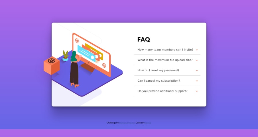
Design comparison
Solution retrospective
It's my very first time creating so much css features (for me its a bit hard), including a specific background, an artwork AND a cube on the artwork. And the background gave me so much difficulties. I tried to resolve some but can't find every answers I needed on the web.
I did my best, But I need some help for the background feature, just check the responsive with some custom resolutions and you will notice some issues.
Thx in advance !
Community feedback
- @pikapikamartPosted about 3 years ago
Hey, great work on this one. Desktop layout looks fine, just needed a bit of height like on the design and lesser
opacity
on the lines as well. It is responsive however on the mobile view, the site is thin, layout could use more width.Some other suggestions would be:
- Don't use
position: absolute
a very large element. If you inspect your layout, hover on eitherhtml
orbody
tag and remove themin-height: 100vh
first, you will notice that it has no height since its element is beingabsolute
. Since you are just using this to center the layout, it would be much better to do it this way. But first, remove these stylings on the.card
:
position top left transform
Also give either
width
ormax-width
on the.card
so that you could control its size. Then on thebody
tag add like :align-items: center; display: flex; flex-direction: column; justify-content: center; min-height: 100vh;
Usually this makes the layout center like what it did on this one, but I notice the box is now on the left side. I supposed it is relative to the
.card
but since we remove theposition: absolute
it is now relative to thebody
tag, so to solve, just useposition: relative
to the.card
.- Always have a
main
element to wrap the main content of the site. For this usemain
tag on the.card
selector. - Use
footer
on the.attribution
so that it will be its own landmark. Remove as well theposition
andtransform
on it , left and top. - When using
img
tag, do not forget to add thealt
attribute, whether the value is empty or not. Because by not including it, screen-reader will instead read the source path of the image which you don't want. So always include it. - Also just an addition. Decorative images should be hidden for screen-reader at all times by using
alt=""
andaria-hidden="true"
to theimg
tag or onlyaria-hidden="true"
if the image is usingsvg
. Only use descriptivealt
on images that are meaningful and adds content to the site otherwise hide the image for screen-reader users. - Avoid using
id
to target and style an element since it is a bad practice due to css specificity. Instead, just useclass
to target element. - Do not remove the
outline
styling. If you did, always include a visual-indicator on the:focus-visible
for those interactive elements like thebutton
a
tag and others. - Also, since you are using
button
on this one. You should have set a default ofaria-expanded="false"
on thebutton
. When it is triggered, it should be set toaria-expanded="true"
. You will use.setAttribute()
method. But if you don't want to do this, I suggest usingdetails
element on this.details
tag is suited for accordion and is accessible from the start so you won't have to manipulate an element's attribute. - You don't need to use
figure
to wrap the accordion arrow-icon, instead, you can use the image path as abackground-image
for example the pseudo-selector like::before
or::after
.
Aside from those, great job again on this one.
Marked as helpful0 - Don't use
Please log in to post a comment
Log in with GitHubJoin our Discord community
Join thousands of Frontend Mentor community members taking the challenges, sharing resources, helping each other, and chatting about all things front-end!
Join our Discord