Design comparison
Solution retrospective
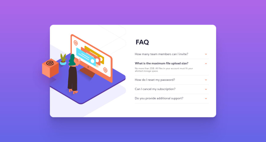
Hi! 👋 Here is my second project here! My page isn't 1:1 but I tried to do only similar. I added an extra scroll(but it works properly only in chrome and safari). I think I could use more relative length units. The hardest thing for me was images, I tried background-image but finally, I used img tags. It'll be great to hear some feedback from you.
Thanks in advance!
Community feedback
- @pikapikamartPosted over 3 years ago
Great work on this one.
Adding that scroll is very nice, a lot of submission that i've seen, the container resizes when a user selects multiple accordion, so points for that creativity of yours.
Also adding a padding-bottom at the
bodytag will be awesome, so that in mobile view, when a lot has been click, the container will not be touching the flooring of the viewport which is doing right now. So adding that padding will be good.But overall, you did really good^^
1@fytrwPosted over 3 years agoThanks for your feedback!
I didn't see that, now it should works good with padding-bottom.
0
Please log in to post a comment
Log in with GitHubJoin our Discord community
Join thousands of Frontend Mentor community members taking the challenges, sharing resources, helping each other, and chatting about all things front-end!
Join our Discord
