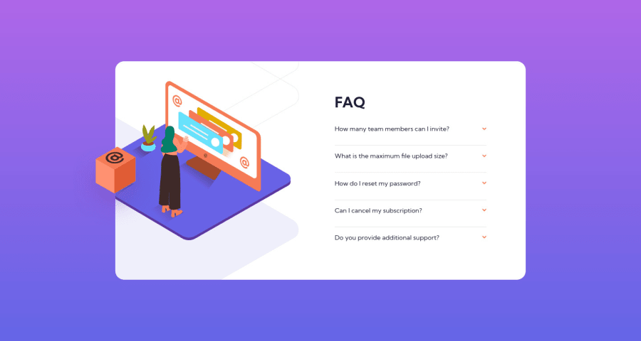
Design comparison
Solution retrospective
Hi everyone, how you doing? This is my second project with JS here and I'm really happy because so far I was coding along while studying online courses, and these challenges provided by Frontend Mentor are helping me to build confidence that I'm actually learning how to do things π₯³ So, thanks to Frontend Mentor!
In fact the most difficult part for me was positioning the images and changing them to the mobile version, but then I realized I could just change the display for each screen, use the desktop images inside the div with overflow: hidden
, and outside for the mobile version, so it would stand over the container.
Still have to improve the responsiveness specially for tablets.
Any comments and suggestions will be much appreciated. Thanks in advance!
Community feedback
- @0xabdulkhaliqPosted over 1 year ago
Hello there π. Congratulations on successfully completing the challenge! π
- I have other recommendations regarding your code that I believe will be of great interest to you.
ACCORDION π΄ :
- The best way to go with creating the accordion elements in this challenge would be with the
details
andsummary
elements (or perhaps a combination of buttons and other elements).
- They are already fairly accessible and provided a clean, semantic way to create accordion elements. I see you have used the
div
&p
elements for the accordions, but those are not interactive or accessible by keyboard, so not all users will be able to open the accordions to see the content inside.
- MDN's reference is a great place to start learning about the
details
andsummary
elements if you are interested.
- If you have any questions or need further clarification, you can always check out
my submission
for this challenge and/or feel free to reach out to me.
.
I hope you find this helpful π Above all, the solution you submitted is great !
Happy coding!
Marked as helpful2@anamilaneziPosted over 1 year ago@0xAbdulKhalid Hi Abdul, thank you so so much for taking your time to help me! I never considered using those elements and how they affect the user experience, so I'm definitely going to study more about them and try to implement on my submission and future projects. Thank you again, it was really helpful and enlightening!
0 - @pperdanaPosted over 1 year ago
Hello thereπ!! Congratulations on completing this challange.
- I have some additional recommendations for your code that I think you'll find interesting and valuable.
π Image element do not have
alt
attributes or you leave it blankfor example code
<img src="images/image-qr-code.png">
In this code you should add
alt
in your code<img src="images/image-qr-code.png" alt="qr code" >
- This
alt
attribute provides alternative text for images, which is important for accessibility purposes. Screen readers, use the alt attribute to read out loud what the image is about, allowing visually impaired users to understand the content of the page.
I hope you found this helpful! π
Happy codingπ€
1@anamilaneziPosted over 1 year ago@Panji200 Thank you very much Panji! This is a detail that have been unnoticed in my last projects indeed, I will definitely fix it and pay more attention in future projects. Thanks again for taking your time to help me to improve my work β
0
Please log in to post a comment
Log in with GitHubJoin our Discord community
Join thousands of Frontend Mentor community members taking the challenges, sharing resources, helping each other, and chatting about all things front-end!
Join our Discord