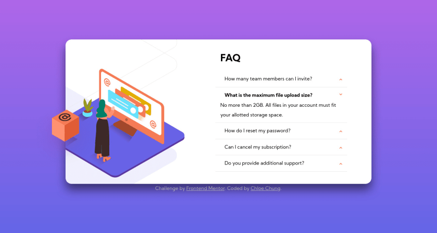
Design comparison
Solution retrospective
- How do I add smooth transitions to the accordion using only css? (I've tried "transition" already :/)
- What is the best way to set a height so that it complements the expanded height (when an accordion is open) of the FAQ box?
- Any feedback is welcome. I'm a beginner :)
Community feedback
- @grace-snowPosted almost 4 years ago
Hi
If you want to do a html-css only solution for this, you probably should use details-summary as Dave suggests.
The alternative would be using checkbox inputs, definitely not radios. With radios, one must always be selected which is not usual behaviour for a set of expandable sections like this. It's an accepted ui pattern for accordions to be able to open multiple at once, so checkboxes could work for this. However, if you're using any inputs at all, never ever ever include
aria-label="undefined"
. It's so important to have good labels. You actually have labels in this so there's no need for aria-label anyway, but if you do include aria-label it should always be meaningful and explanatory of what the input is/does.If none of those options appeal, I'm afraid you're on to javascript next 😉
With the transition question, it looks like you figured it out already? The jump that's happening is because it would need a transition on selected and not status, and because of the issue with radios only being able to have one selected at a time.
Other than that, make sure your body/background has a min-height not height so it can grow as needed with the content behind it. And make sure you've got enough space at the top to be able to See the image on mobile.
I hope all that makes sense (mostly) and is helpful for you ☺
1@chungchloePosted almost 4 years agoThank you for the detailed feedback, Grace! They all make sense, and are very helpful ☺️
0 - @dwhensonPosted almost 4 years ago
Hi Chloe - nice work on what I guess is your first challenge? And not an easy one either - I struggled with this one.
One thing that really helped me with this one was the use of the
details
andsummary
HTML elements. These have much of the functionality you are looking for baked in and can be styled with a little bit of work.I think this will enable you to simplify your code and hopefully make things a little easier. Good work on the background images - they work really well!
0@chungchloePosted almost 4 years agoI never knew there was details and summary in HTML. Thank you for the advice!
0
Please log in to post a comment
Log in with GitHubJoin our Discord community
Join thousands of Frontend Mentor community members taking the challenges, sharing resources, helping each other, and chatting about all things front-end!
Join our Discord