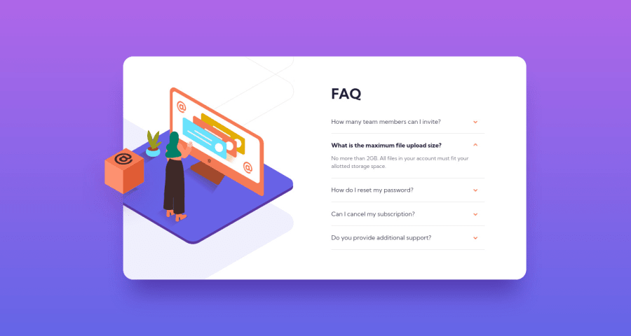
Design comparison
Solution retrospective
Those background images gave me some headache, had to tweak and change it a bunch. I’m curious to hear from you about code style and best practices. Cheers !
Community feedback
- @MiculinoPosted almost 3 years ago
Congrats on completing the challenge, @stfnpczk!
Your solution looks quite good. Btw, I know how annoying the image part must've been. I struggled a lot with those too when I build this challenge ;)
Based on what I've seen in your solution, I have a few suggestions / observations:
-
Your card's height expands when you open an accordion. That shouldn't happen. There are multiple approaches to this. Try to find one that will fit in with the rest of the project and not cause any other unexpected issue
-
There's a feature missing in the project. If you have an accordion already open and you click on another one, the accordion that's currently open should close before the other one is opened.
Marked as helpful0 -
- @renrasPosted almost 3 years ago
Great work!
Things I'd improve on :
-
add a fixed height to the main div so it doesn't keep moving when you open/close an accordion
-
animate the accordion
Marked as helpful0 -
Please log in to post a comment
Log in with GitHubJoin our Discord community
Join thousands of Frontend Mentor community members taking the challenges, sharing resources, helping each other, and chatting about all things front-end!
Join our Discord