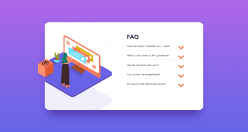
Design comparison
SolutionDesign
Solution retrospective
For this challenge I struggled to set the images properly. Any feedback will be appreciated :)
Community feedback
- @grace-snowPosted almost 3 years ago
Hello
On mobile for me the questions and answers are overlapping each other making them unreadable. I think this is because you've given the buttons an explicit height rather than min height or just using padding too and bottom on them, so should be easy to fix.
More important than that though is the foundational html lessons in this challenge.
- headers are meaningful landmark elements, they cannot be blank and you can only have one per page
- instead, background images could be on divs or pseudo elements
- well done for using buttons for the accordion triggers. These also need to have the aria-expanded attribute which toggles between false and true depending on whether the accordion is open
- the down arrows are not meaningful/important images and create unnecessary repetition for screenreader users . They should have empty alt attributes (aria-hidden or role presentation would also hide them)
I hope this helps you. Good luck
Marked as helpful0@Yuko-codePosted almost 3 years agoThank you for detailed feedback. I’ll work on it. @grace-snow
0
Please log in to post a comment
Log in with GitHubJoin our Discord community
Join thousands of Frontend Mentor community members taking the challenges, sharing resources, helping each other, and chatting about all things front-end!
Join our Discord