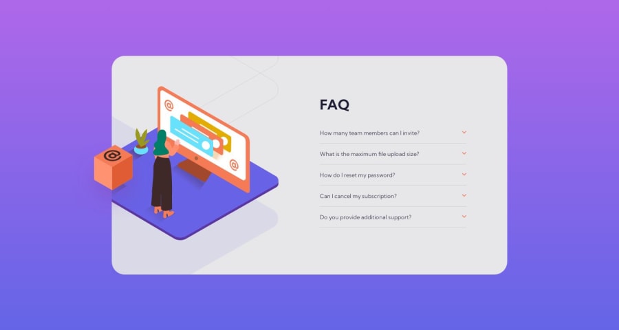
Design comparison
SolutionDesign
Solution retrospective
I found it extremely difficult trying to get the image sizes and positions correct and had to rely heavily on the figma file. Would appreciate any feedback to make it easier to get those correct in case the design file isn't available.
Community feedback
- @0xabdulkhaliqPosted over 1 year ago
Hello there 👋. Congratulations on successfully completing the challenge! 🎉
- I have other recommendations regarding your code that I believe will be of great interest to you.
ACCORDION 🔴 :
- The best way to go with creating the accordion elements in this challenge would be with the
details
andsummary
elements (or perhaps a combination of buttons and other elements).
- They are already fairly accessible and provided a clean, semantic way to create accordion elements. I see you have used the
div
,a
&p
elements for the accordions, but those are not interactive or accessible by keyboard, so not all users will be able to open the accordions to see the content inside.
- MDN's reference is a great place to start learning about the
details
andsummary
elements if you are interested.
- If you have any questions or need further clarification, you can always check out
my submission
for this challenge and/or feel free to reach out to me.
.
I hope you find this helpful 😄 Above all, the solution you submitted is great !
Happy coding!
Marked as helpful1@nelsonbernardPosted over 1 year ago@0xAbdulKhalid thanks for the feedback! I had no idea the details and summary elements existed. This is a huge help. I really appreciate it.
0
Please log in to post a comment
Log in with GitHubJoin our Discord community
Join thousands of Frontend Mentor community members taking the challenges, sharing resources, helping each other, and chatting about all things front-end!
Join our Discord