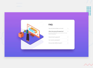
Design comparison
Solution retrospective
Hi everyone! What do you think? My oppinion, code could be much more cleaner.. but I don't konw how.. If you know how, let me know. Any comment is greatly appreciated. <3
Community feedback
- @samuelpalaciosdevPosted over 3 years ago
Hi, @spymon👋
Great job on this challenge. Your solution looks very good and it scales pretty nicely👍
I only suggest some things 😉:
-Be careful with specificity. I mean, you have extra large selectors like this one
.accordion .questionBx .answer pyou could simplify that setting a class to that paragraph.-The transition of changing the font-weight when you open the question. It would be smoother if you decrease the main paragraph font-size to 1px less, because if you if you leave it as it is when you open the question, it makes a line-break that wasn't before and it feels not so smooth.
I hope this would help you, have a nice day, keep coding!💙
1@spymonPosted over 3 years agoHi, @samuelpalaciosde!
Thank you for pointing out those details, I really appreciate it.
-
I watched organizing CSS videos. It gave me a pretty good understanding of why I should avoid extra-large selectors, and how to follow good practice. I also start using Sass and BEM, and it's a game-changer!
- [Decoupling the Front-end with Modular CSS By Julie Cameron] (https://www.youtube.com/watch?v=HoQ-QEusyS0)
- Organizing CSS with OOCSS, SMACSS, and BEM - Matt Stauffer
-
The transition is smoother now. :) I followed your advice and change
font-size: 17px.
Thank you again for your suggestions.
0 -
- @AgataLiberskaPosted over 3 years ago
Hi @spymon, well done on this challenge, I think it looks really good overall!
A small detail - on some mobile sizes, the text of the question is overlapping with the arrow, could be a good idea to add some padding there, maybe make the font a tiny bit smaller.
More importantly, though, the accordions should be toggled with buttons - so that they're accessible with keyboard.
Hope this helps :)
1@spymonPosted over 3 years agoHi @AgataLiberska, thank you for pointing out those details, I really appreciate it.
I followed your advice and it looks better now! The text on small screens is no longer overlapping the arrow, it's a bit smaller and the questions are now buttons and are accessible with a tab key. I also removed the "not so good looking" outline and replace it with the orange text color, which lends itself more to the style.
Thank you :)
0
Please log in to post a comment
Log in with GitHubJoin our Discord community
Join thousands of Frontend Mentor community members taking the challenges, sharing resources, helping each other, and chatting about all things front-end!
Join our Discord
