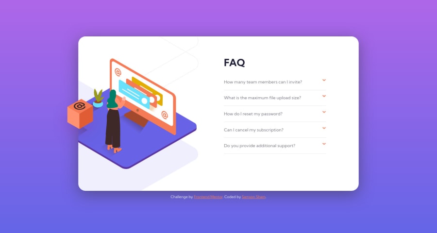
Design comparison
Solution retrospective
My question for this challenge:
- Should the accordion expand only one panel each time, rather than all panels can be expanded? i.e. while there is already an expanded panel, if another header is clicked, the previous expanded panel should collapse.
- I noticed that the @ box in left hand side is shifted a bit to left in active-state design. Is it intentional? If yes, what does it mean? Make the box shift when hover the accordion header? or when the panel expanded?
Community feedback
- @vanzasetiaPosted over 2 years ago
Greetings, Samson! 👋
It's great to see you completing another challenge! 🎉 Good effort on this challenge! 👍
Regarding your questions,
- Yes, I would recommend creating a functionality where the user is only allowed to open one accordion panel at a time. This will prevent the card from having too much height because of the users open all the accordion panels.
- I guess it's just a tiny mistake on the design. I didn't bother about it and make it position the same no matter what happened on the site.
I notice that you are using JavaScript to generate the accordion panels. I think that's a unique approach. Does it make it easier to work with the challenge? I'm curious why you are choosing this approach. 😅
Anyway, I would suggest not setting any
font-size
on thehtml
or the:root
element. Changing thehtml
or root font size can cause huge accessibility implications for those of the users with different font size or zoom requirements.That's it! Hope this helps. 😊
Marked as helpful1@samsonshamPosted over 2 years ago@vanzasetia Hi Vanza! Good to see you! Thank you for your reply. I updated my accordion to open one at a time and removed
font-size
in:root
as you suggested. 😄 I have seen people define lots of things in:root
and I thought it looks like a pro so I just try to do it as well. But I am not sure what should be put into:root
and what should not.For the js generate panels part,
- I think there is little difference with or without js in this challenge since 5 panels are not too many. But if it goes to like 10 panels, putting them altogether would make the HTML a bit too long. So I would like to do it DRY.
- I saw
JS
labelled in this project so it's good to practice more js in this project.😉 - Writing a map to generate repeating code like in jsx is cool. But it would be overkill to install a library like react for a small project so I do it by a little piece of template literal.😁
This is a nice question though. So I have done a lighthouse test for a with and without js version to see if there is any performance difference But nothing big is found (Could be the project size is not large).
Thanks again for your kindly help! Have a good day!
0@vanzasetiaPosted over 2 years ago@samsonsham You're welcome! 😊
In the
:root
element I usually only put my custom properties. The most important thing is I would recommend making thebody
element as the main element of the page, not thehtml
or the:root
element.Ah, I see the reason. You were trying to practice as much JavaScript as you can. Well, that's a great reason. 👍
Have a nice day too!
1
Please log in to post a comment
Log in with GitHubJoin our Discord community
Join thousands of Frontend Mentor community members taking the challenges, sharing resources, helping each other, and chatting about all things front-end!
Join our Discord