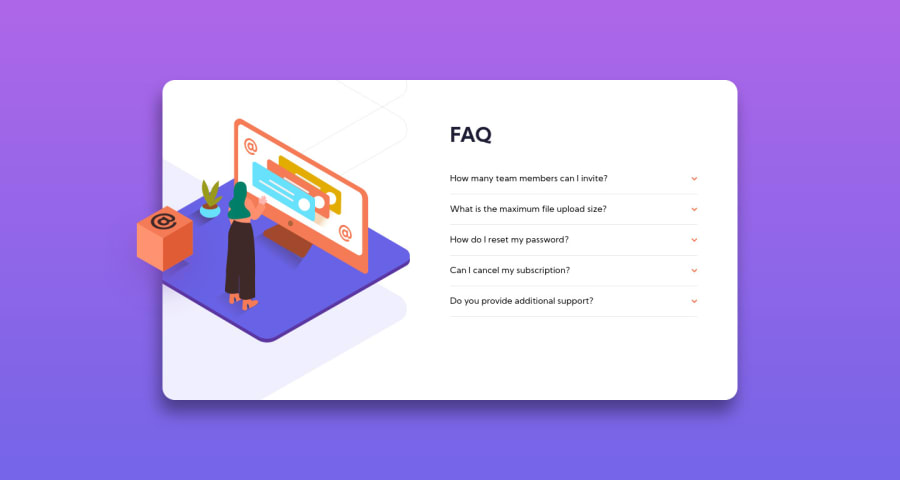
Design comparison
Solution retrospective
This is the second challenge that I tried here and I can say that this help me a lot to understand better how projects works! My question is, the background image moves when all questions are opened. Is that another way to do this so that the image doesn't change position?
Community feedback
- @Andrii-RohovPosted over 3 years ago
Hi, great solution. You can try to improve it by adding (cursor: pointer;) to all buttons. Also, when you hover over buttons, the text should be orange, try to add button:hover { color: #f47b56; }
Marked as helpful1@carolandrade1Posted over 3 years ago@Andrii-Rohov thank you for point that! I forgot to add this styles, but I am going to change that.
0 - @FarisPalayiPosted over 3 years ago
Yeah, since your card doesn't have a fixed height, after you open a few questions, the card's size increases. And since your background image have a
align-items: center;
it'll try to make the image in the middle of the card (based on the card's height). So yeah, that's why the image moves.If you don't want the image to move, then on the
.card__image
you can setalign-items
value toflex-start
and give it amargin-top
.(There are a lot of other ways you could achieve the same result, I just said to you something that popped into my mind right now). Hope it all makes sense.And also your solution looks excellent, responds nicely. Well done tackling this challenge 👏
Marked as helpful1
Please log in to post a comment
Log in with GitHubJoin our Discord community
Join thousands of Frontend Mentor community members taking the challenges, sharing resources, helping each other, and chatting about all things front-end!
Join our Discord