Design comparison
SolutionDesign
Solution retrospective
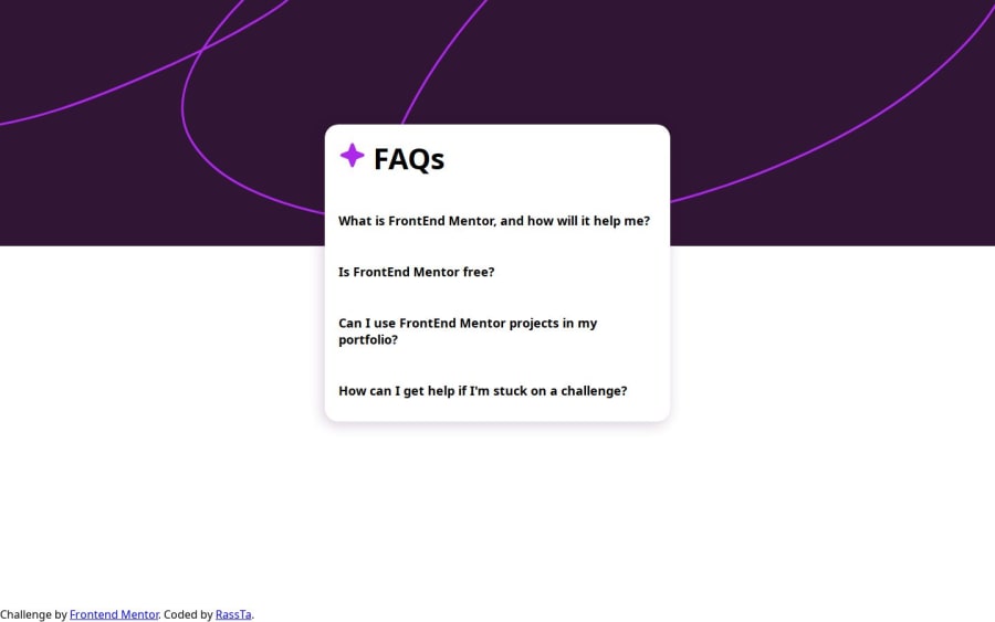
Hey people, I'm Rasta, a newbie, and I need your help first of all, when you zoom out, you can see that the background gets smaller. I don't know how to fix it. I did what the internet told me and those solutions caused more problems. the second problem is about the plus and negative icons. they're visible when I open the HTML with my browser, but I can't see them now that I uploaded it to vercel.
Community feedback
- @BlackpachamamePosted 10 months ago
Greetings! you have done a great job 😎
📌 Some suggestions
- It is normal that the background image becomes smaller, since you set a fixed width at
1600px, when the screen exceeds that width, the image remains at 1600px as the maximum width. To make it fit the width you could put100%instead of1600px - Remember that you also have the image for the mobile version. You should use this one for those screens. You can do this with mediaquerys
- To improve the semantics of your HTML, you can change your
<div class="attribution">to a<footer class="attribution"> - The correct link for fontawesome icons would be (You can find it here):
<link rel="stylesheet" href="https://cdnjs.cloudflare.com/ajax/libs/font-awesome/4.3.0/css/font-awesome.css" integrity="sha512-XJ3ntWHl40opEiE+6dGhfK9NAKOCELrpjiBRQKtu6uJf9Pli8XY+Hikp7rlFzY4ElLSFtzjx9 GGgHql7PLSeog ==" crossorigin="anonymous" referrerpolicy="no-referrer" />- For your next challenge try to use the most current version of fontawesome
- You have an error in your HTML:
<div class="attribution">
    Challenge by <a href="https://www.frontendmentor.io?ref=challenge" target="_blank">Frontend Mentor</a>.
    Coded by <a href="#">RassTa</a>.
0 - It is normal that the background image becomes smaller, since you set a fixed width at
Please log in to post a comment
Log in with GitHubJoin our Discord community
Join thousands of Frontend Mentor community members taking the challenges, sharing resources, helping each other, and chatting about all things front-end!
Join our Discord
