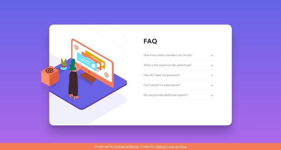

Design comparison
SolutionDesign

Solution retrospective
What could I improve to this code?
Please log in to post a comment
Log in with GitHubCommunity feedback
- @JordanKleinbaum
Great job! Everything looks great. Just from a UX perspective, it is a little redundant to have the orange carrot to the right as well as the black one to the left. Besides that, everything looks good!

Join our Discord community
Join thousands of Frontend Mentor community members taking the challenges, sharing resources, helping each other, and chatting about all things front-end!
Join our Discord