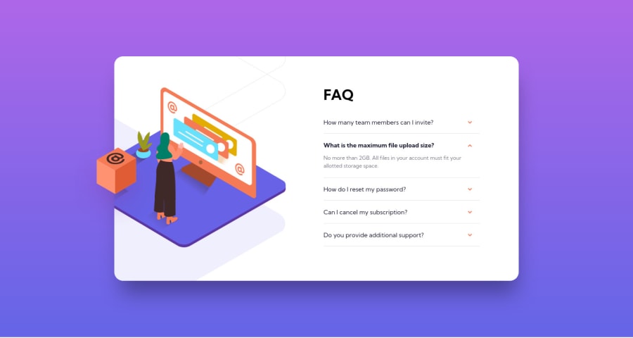
Design comparison
SolutionDesign
Solution retrospective
Any feedback will be highly appreciated.
Thanks....
Community feedback
- Account deleted
Hello there! 👋
Congratulations on finishing your challenge! 🎉
I have some feedback on this solution
- add to the body min-height:100vh;
- add to the arrow cursor:pointer; so that the user knows its clickable
i hope this is helpful and goodluck
Marked as helpful1@ArifKhanEverPosted about 3 years ago@Old1337 Thanks for the feedback. I added that but I omitted it due to some problems in mobile design. But it's okay now.
1
Please log in to post a comment
Log in with GitHubJoin our Discord community
Join thousands of Frontend Mentor community members taking the challenges, sharing resources, helping each other, and chatting about all things front-end!
Join our Discord
