Design comparison
SolutionDesign
Solution retrospective
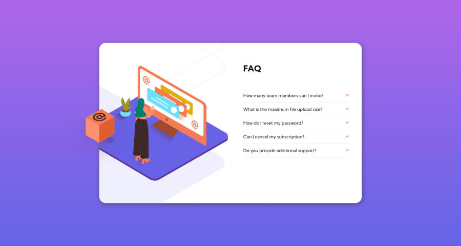
I tried my best only using HTML, CSS, and JS.
The hardest part for me was to position background images and make the project responsive for mobile screens, so I'm not sure how it will look on your device.
Another headache was when I tried using CSS Grid to divide both sides of the container without causing overflow. Eventually, I decided to use FlexBox because I felt more confident.
Finally, I feel like I still don't handle class naming correctly, but I will try using the BEM methodology in further projects.
Any feedback will be appreciated!
Community feedback
Please log in to post a comment
Log in with GitHubJoin our Discord community
Join thousands of Frontend Mentor community members taking the challenges, sharing resources, helping each other, and chatting about all things front-end!
Join our Discord
