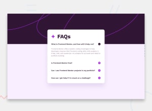
Design comparison
SolutionDesign
Community feedback
- @bccpadgePosted 10 months ago
Hello @jceballos29. Congratulations on completing this challenge!!!🎉
I have a few suggestions you might be interested in to improve your solution.
HTML 📃:
- Take look at this article to make your website more semantic - HTML Semantic Elements
- Using a
<div>on a website has no semantic meaning
- Using a
- For this project, a HTML button tag would be better and users can use
TABon the keyboard to navigate to each question. - Accordion Example from ARIA Authoring Practices Guide (APG)
CSS 🎨:
- Font size shouldn't be in pixels because pixels don't scale when users want change their font size in preferred browser.
- Here is an Frontend Mentor article on Responsive Design and W3schools on CSS Media Queries
Here is my solution to this challenge - FAQ accordion
I hope you find this useful and don't hesitate to reach out if you have any questions
Marked as helpful0 - Take look at this article to make your website more semantic - HTML Semantic Elements
Please log in to post a comment
Log in with GitHubJoin our Discord community
Join thousands of Frontend Mentor community members taking the challenges, sharing resources, helping each other, and chatting about all things front-end!
Join our Discord
