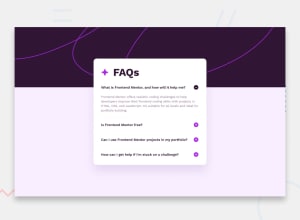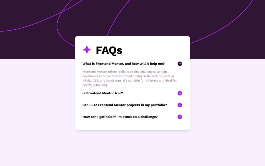
Design comparison
Solution retrospective
I'm glad I practiced using ARIA attributes. At first, I thought it would be difficult to implement them into my workflow, but thanks to the articles I read, I realized that there are many tools that help ensure proper usage.
What challenges did you encounter, and how did you overcome them?I wanted to use the accordion from Shadcn, but unfortunately, I couldn't understand how Radix-UI handles icons inside it. Therefore, I decided to create the accordion myself according to the required specifications.
What specific areas of your project would you like help with?Any feedback is welcome 😉
Community feedback
- @elisilkPosted about 1 month ago
Hi 👋 @Smailen5,
Congrats on a cool solution. 👏 I appreciate that you are using ARIA attributes and that your solution is keyboard accessible. That's great!
If you are up for diving in just a little further 🤿, I'd suggest a few things:
- To be a bit more consistent with the design, I'd suggest starting with the first FAQ open. Does your component allow for that?
- I'd also suggest looking at how the FAQ question headings look center aligned when you move to smaller viewport widths (e.g., the mobile view of 375px viewport width). I think this is because you are using a
<button>
element for those question headings and the default user-agent styling for them istext-align: center
. It isn't a problem at larger viewport widths because you have the button set asdisplay: flex
container withjustify-content: space-between;
And that means when the FAQ question is just one line, the flex container pushes the question text all the way to the left. But when the FAQ question breaks onto more than one line, then the center text alignment shows up. So I'd suggest adding atext-align: left;
somewhere in the CSS that you are putting on those buttons. - It doesn't look like the Work Sans font that is specified in the design is loading properly. When I view the solution, I see your fonts rendered primarily in Helvetica. I'm not certain the issue as I see that you are including the links to those assets. But maybe look into how you are loading the fonts? Or possibly the
url
path that you are using? Sometimes things work well on your local machine, but then when pushed to the server the url paths get broken.
Anyway, just some ideas to consider if you are thinking about improving on this solution. 🤔
Happy coding. 💻
Eli
Marked as helpful1@Smailen5Posted about 1 month agoThank @elisilk for the suggestions, they were really helpful!
I hadn’t noticed that the text wasn’t correctly aligned as per the requested design, a simple
text-left
on the button fixed it.You're right, I should have opened the first question to be consistent with the design. I added:
useEffect(() => { setOpenIndex(0); }, []);
I hope this is noticeable in the Frontend Mentor screenshot.
Thank you for pointing out that the font wasn’t loading correctly. I actually saw a 404 error for the font in the network tab, but I didn’t really understand why. I also added the correct path, and eventually, I resolved it by placing the fonts folder directly in the public directory.
Thank you for your feedback; it was truly invaluable! 😉 I’ve added an acknowledgment in the
README
.0
Please log in to post a comment
Log in with GitHubJoin our Discord community
Join thousands of Frontend Mentor community members taking the challenges, sharing resources, helping each other, and chatting about all things front-end!
Join our Discord