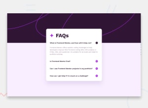
Design comparison
Solution retrospective
-
I want to know is it better to use media query with
min-widthormax-width? -
my plus and minus icon position is good for desktop and mobile screen size but it does not work in the middle. I mean between these two sizes. what can i do to make it responsive for all sizes? shall i use js instead of
::labelpseudo classes? -
If you see any other problem or have any suggestion please tell me. thanks.
Community feedback
- @AbderrahmaneGuerinikPosted about 1 year ago
Hey kamran ! Pretty nice component and close to the design good job,
for your first question there is no difference between using max-width and min-width in media queries, it depends on your working strategy (mobile first approach or desktop first), in mobile first approach you'ill often use min-width and for desktop first approach you'll use max-width.2- for minus and plus i suggest you use two images, in intial state the image with plus has display: none, and on click you should make the other image display: none , and reset the display of the minus image, you can do that using js or if you're using react just use conditional rendering, Btw i recommend you use <button> tag instead of span for more accessibility.
I hope this would help you! 😊
Marked as helpful0@kaamiikPosted about 1 year ago@AbderrahmaneGuerinik Thanks for your great feedback. I will work on it.
0
Please log in to post a comment
Log in with GitHubJoin our Discord community
Join thousands of Frontend Mentor community members taking the challenges, sharing resources, helping each other, and chatting about all things front-end!
Join our Discord
