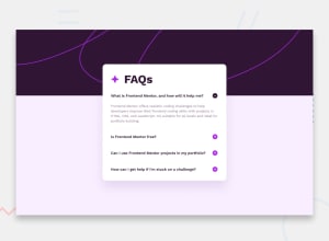
Design comparison
Solution retrospective
In this project, I struggled to complete it on my own. I managed to get halfway through before hitting a roadblock that I couldn’t overcome. After spending a lot of time stuck, I decided to look for similar tutorials to help me understand the process better. I attempted to follow along with the tutorials, learning as I went, but I still found it challenging. Despite my efforts, I was unable to display the minus icon when opening a question to close it. This experience has been frustrating, and I’m disappointed that I couldn’t finish it independently. However, I’ve submitted my work to the community in the hope of receiving feedback and guidance. I’m committed to continuing my learning journey and will use this experience to improve in future projects.
What specific areas of your project would you like help with?As a complete beginner, I think CSS and JavaScript are the things that I need to improve the most at this point.
Community feedback
- @Alex-Archer-IPosted 8 months ago
Hi!
Actually it's quite a decent work. You even manage to make them animated =)
Your way to change images is working, you just overlooked this part in the
else ifbranch =)plusIcon.style.display = "none"; minusIcon.style.display = "none";But there is more easily way to do it. You can reach
srcattribute of the image via JS and change it.Marked as helpful1@Taninwat-55Posted 8 months ago@Alex-Archer-I Thank you so much, Alex! I truly appreciate your feedback—it really feels like having a mentor in this community. I’ll continue working hard and posting the solutions. Thanks a ton, Alex!
1@Alex-Archer-IPosted 8 months ago@Taninwat-55
Yep, you're welcome again =)
Cool idea to male the whole line as button, by the by. I didn't think about it =)
0
Please log in to post a comment
Log in with GitHubJoin our Discord community
Join thousands of Frontend Mentor community members taking the challenges, sharing resources, helping each other, and chatting about all things front-end!
Join our Discord
