Design comparison
Solution retrospective
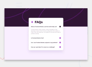
I had difficulty aligning the plus minus images to the paragraph, it looks ok, but I'm not completely satisfied with it. I also had difficulty with the box-shadow its hard to tell looking at the design images where the box-shadow is exactly.
What specific areas of your project would you like help with?I would appreciate any and all feedback on this challenge, especially on the aligning of the plus and minus images. Thanks.
Community feedback
- @Grego14Posted 7 months ago
Hello! 🎉 congratulations on completing the challenge! 🎉
Leave the alt attribute empty if the image has no semantic meaning or is for decoration.
I recommend you use the max-width property instead of the br tag to make the texts break.
To make the plus and minus icons align with the text use the align-items: center; property on the .accordion element.
I recommend that you read about Event Delegation, since you are adding an eventListener for each plus icon and minus icon, when you could do everything using a single click eventListener .
I hope this helps! 😁
Marked as helpful0
Please log in to post a comment
Log in with GitHubJoin our Discord community
Join thousands of Frontend Mentor community members taking the challenges, sharing resources, helping each other, and chatting about all things front-end!
Join our Discord
