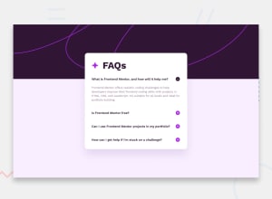
Design comparison
Solution retrospective
I’m most proud of successfully creating a smooth and responsive FAQ accordion that works well across various screen sizes, from mobile (375px) to desktop (1440px). The smooth transitions when expanding and collapsing the answers, along with the dynamic switching between the plus and minus icons, provide a polished and user-friendly experience. Additionally, adhering to WCAG guidelines for accessibility ensures that the design is usable by everyone, which is important for building inclusive web applications.
What would I do differently next time?
Next time, I would focus more on improving the performance of the accordion, particularly when dealing with larger amounts of content or nested elements. I’d explore more advanced techniques such as lazy-loading content or using JavaScript frameworks like React to optimize state management. Also, I would consider implementing a "remember" feature, where the state of the accordion (expanded or collapsed) persists even after navigating away from the page. Lastly, I’d refine the background image placement for more complex layouts and further test responsiveness on a wider range of devices.
This reflective process has given me valuable insight into areas for future improvement, such as performance and advanced features.
What challenges did you encounter, and how did you overcome them?One of the main challenges I faced was ensuring the background image scaled properly across different screen sizes without being cut off or misaligned. To overcome this, I adjusted the CSS properties, including background-size and background-position, ensuring it covered the container while remaining responsive. I also tested it on various screen widths to confirm it worked smoothly on both mobile and desktop.
Another challenge was creating a smooth transition effect for the plus and minus icons when expanding or collapsing the answers. Initially, the icons switched instantly, making the interaction feel abrupt. I solved this by adding CSS transitions to the visibility and opacity of the icons, which resulted in a smooth, gradual change that improved the user experience.
Lastly, ensuring that only one question could be expanded at a time posed a challenge in handling multiple events dynamically. I overcame this by using JavaScript to close any open sections before expanding a new one, while ensuring the icons also updated correctly. These challenges helped improve my understanding of JavaScript event handling and CSS animations.
What specific areas of your project would you like help with?Responsive Design Adjustments: While I have made the FAQ accordion responsive for both mobile (375px) and desktop (1440px) widths, I would appreciate feedback on how well it adapts to a full range of screen sizes, especially smaller devices (320px) and larger screens. Any suggestions for improving flexibility or WCAG compliance would be helpful.
Smooth Transitions for Icons: Although I implemented CSS transitions for the plus and minus icons, I’m still unsure if the transition is as smooth as it could be. Feedback on how to further enhance the switching effect would be valuable.
Background Image Scaling: The background image works well on most screens, but I had some issues with it being slightly cut off on the right side in certain resolutions. Any advice on how to optimize the background image for all screen sizes without losing quality or alignment would be appreciated.
Accessibility Improvements: While I've considered basic accessibility principles, I would like suggestions on improving keyboard navigation, ARIA labels, or other accessibility features to ensure the FAQ accordion meets best practices.
Your feedback on these areas would help me refine and improve this project!
Community feedback
Please log in to post a comment
Log in with GitHubJoin our Discord community
Join thousands of Frontend Mentor community members taking the challenges, sharing resources, helping each other, and chatting about all things front-end!
Join our Discord
