Design comparison
SolutionDesign
Community feedback
- @tOnski86Posted 3 days ago
Awesome implementation!
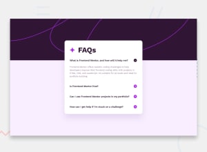
I don't know if it's the look you were going for - but just saw that you implemented
align-items:centeron the body to center the card - you might want to tryalign-items: startso that the card does not open (and expand) from the center, but rather open from the top on smaller screens.Great job and keep going!
Marked as helpful0
Please log in to post a comment
Log in with GitHubJoin our Discord community
Join thousands of Frontend Mentor community members taking the challenges, sharing resources, helping each other, and chatting about all things front-end!
Join our Discord
