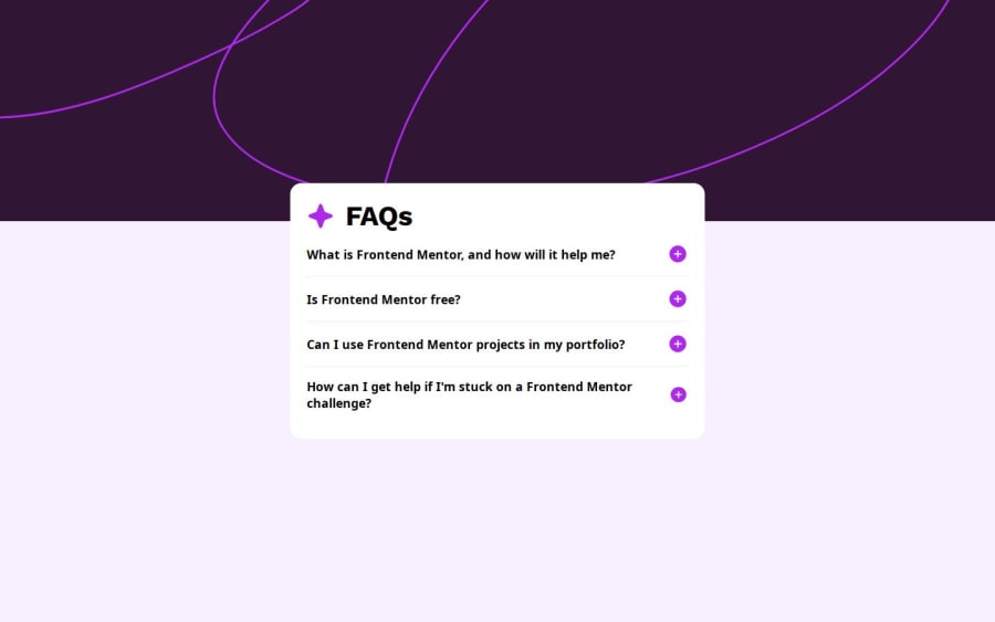

Design comparison

Solution retrospective
What I am Proud Of?
-
Good accessibility
-
Effective Functionality
-
Clean & Well-Structured Code
What Would I Do Differently Next Time?
- Use CSS for Plus/Minus Icon Toggle
-
Challenge: Initially, the accordion's transition felt abrupt or didn't work correctly when toggling sections.
-
Solution: Used scrollHeight to dynamically set the height of the expanded content instead of using max-height: 0;. This ensured a smooth transition when opening and closing FAQ items.
-
I’ve implemented aria-expanded and aria-hidden for screen readers, but are there any improvements I could make?
-
Is my keyboard navigation implementation (handling Enter and Space keys) the best approach, or is there a more efficient way?
-
Right now, I’m using max-height with scrollHeight for the animation. Is there a better way to make the expanding/collapsing effect smoother?
Community feedback
Please log in to post a comment
Log in with GitHubJoin our Discord community
Join thousands of Frontend Mentor community members taking the challenges, sharing resources, helping each other, and chatting about all things front-end!
Join our Discord