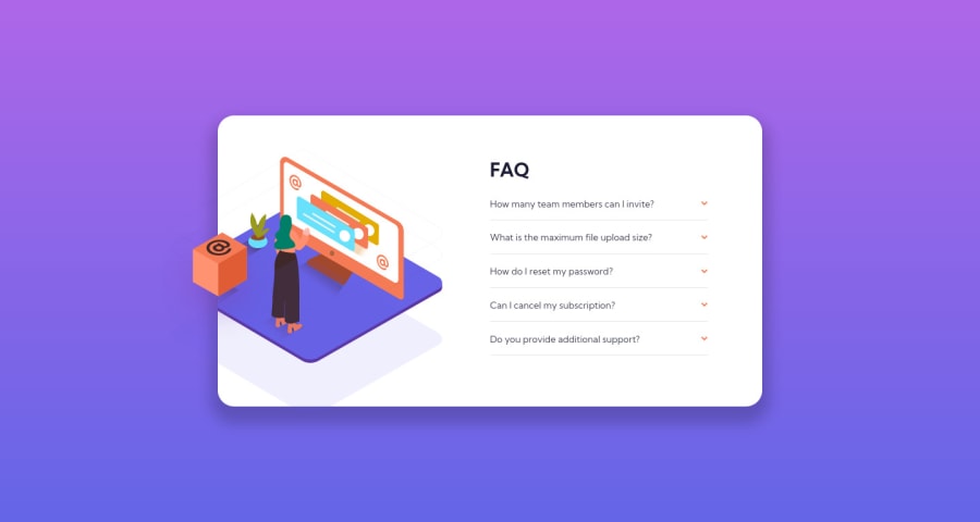
Design comparison
Solution retrospective
I appreciate any suggestion to improve my code! Feel free to tell me what I could have done better. It's been a while since the last challenge. This need more improvement and it's not the final version.
Community feedback
- @DavidMorgadePosted over 2 years ago
Hello Vittorio, congrats on getting the solution for this challenge!
If I have your permission, I would like to give you a few tips:
-
You should really add a
cursor: pointerto the wholequestiondiv, cause it feel strange that text have the pointer cursor but the arrow doesn't have it! -
Another thing I noticed is that the arrow image is swapping directions onclick, but they don't go back to the previews direction if you click on them again, only if you click in other question, maybe your JS needs a
togglemethod there, instead of adding thescaleproperty. Some cool dropdown effect when showing the paragraph would be cool also! -
For the html, in my opinion, it would be better semantically to group everything on a
sectionand divide everything onarticles.
Hope my feedback helps you, good job!
0 -
Please log in to post a comment
Log in with GitHubJoin our Discord community
Join thousands of Frontend Mentor community members taking the challenges, sharing resources, helping each other, and chatting about all things front-end!
Join our Discord
