Solution retrospective
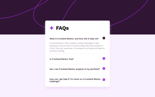
I managed to add some transitional effects for the expansion and collapse for the answer cards.
What specific areas of your project would you like help with?One thing I am not too sure is if I need to further make my code "DRY". I feel like for now I am applying the same logic and almost identical codes to all the answer cards, and the only difference is the sequence number of each question and answer. (I think of moving the question and answer to their own data file, and creating a for loop to display them, but I don't know if that's the ideal approach?)
Any input would be appreciated!
Please log in to post a comment
Log in with GitHubCommunity feedback
No feedback yet. Be the first to give feedback on sherimin's solution.
Join our Discord community
Join thousands of Frontend Mentor community members taking the challenges, sharing resources, helping each other, and chatting about all things front-end!
Join our Discord