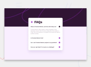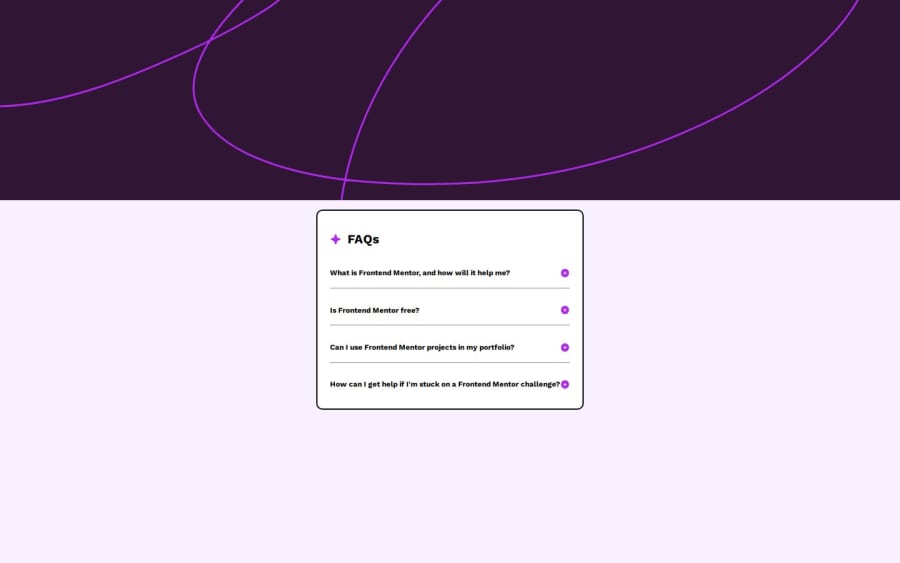
Design comparison
Solution retrospective
Using key presses to navigate the page as well as using ARIA attributes.
What challenges did you encounter, and how did you overcome them?-How to toggle the questions independently and use of the keyboard.
What specific areas of your project would you like help with?Curious to know which other ways this challenge could have been done.
Community feedback
- @HekimianzPosted 3 months ago
Hi @khalagai!
Your HTML looks well-organized. Here are a few suggestions to enhance it further:
-
Use of IDs: Instead of using IDs like
img0
,img1
, etc., consider using classes. This will make your code more reusable and less prone to conflicts. -
Accessibility Improvements:
- Make sure the
alt
attributes are descriptive. For example, “plus” could be more descriptive like “expand icon” to help screen readers. - Add
aria-expanded
attributes to the collapsible elements to improve accessibility.
- Make sure the
-
Styling with Classes: Move inline styles to CSS. For instance, use a class like
hidden
to manage visibility. -
HTML Structure: Consider if you need
<hr>
elements for visual separation or if they could be replaced with CSS styling. -
Responsiveness: Your current CSS does not seem to handle larger sizes very well. The container width is fixed at 300px, which might not scale properly on larger screens. Also, the layout may need further adjustments to ensure a responsive design across various desktop sizes.
0 -
Please log in to post a comment
Log in with GitHubJoin our Discord community
Join thousands of Frontend Mentor community members taking the challenges, sharing resources, helping each other, and chatting about all things front-end!
Join our Discord