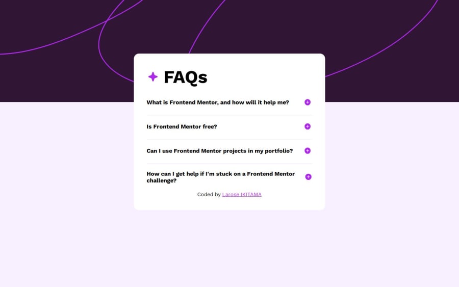
Design comparison
Solution retrospective
First I'm proud to be able to realise this challenge then, to have learned to do the screen reader tests and keyboard accessibility finally, soon in my projects I will write my code respecting the semantic HTML.
What challenges did you encounter, and how did you overcome them?I didn't have any challenges. F I N A L L Y 😅
What specific areas of your project would you like help with?All remarks are welcome
Community feedback
- P@ralphvirtucioPosted 5 months ago
Hi @ikitamalarose,
Great job on completing this challenge! Your solution looks solid. I have one suggestion: consider replacing the width on your #container selector with min-width to prevent elements from becoming too narrow on smaller screens, or use max-width to keep elements from expanding too much on larger screens.
Keep up the great work!
CODE UP ☕🧑💻🙌!
Marked as helpful0
Please log in to post a comment
Log in with GitHubJoin our Discord community
Join thousands of Frontend Mentor community members taking the challenges, sharing resources, helping each other, and chatting about all things front-end!
Join our Discord
