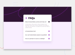
Design comparison
SolutionDesign
Solution retrospective
What are you most proud of, and what would you do differently next time?
It took me less time than other project. I think my skills has increase since i last started doing project.
What challenges did you encounter, and how did you overcome them?It was hard to create a button to show and hide the content but i get help from AI.
What specific areas of your project would you like help with?Issues I’m Facing
- Accessibility Concerns:
- ARIA Hidden Elements: I need to ensure that elements with aria-hidden="true" are not focusable and do not contain focusable elements.
- Main Landmark: The document should have one main landmark to improve accessibility.
- Functionality:
- Independent Toggle: Each question should toggle its answer independently without affecting the visibility of other answers.
- Button Visibility: The toggle button should remain visible at all times, and clicking it should only affect the visibility of the corresponding answer.
Community feedback
- @Ajaya-RajbhandariPosted about 1 month ago
The Desktop Version is smaller than the Original Design.
0
Please log in to post a comment
Log in with GitHubJoin our Discord community
Join thousands of Frontend Mentor community members taking the challenges, sharing resources, helping each other, and chatting about all things front-end!
Join our Discord
