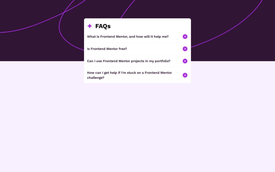
Design comparison
Solution retrospective
Did i do the accessibility part of this challenge correctly? Thanks, for any feedback in advance.
Community feedback
- @enzo-mirPosted 12 months ago
Nice way to make this challenge maybe try to implement that the first accordion should be open at the start of the visit, finally as the preview.
Well done !
3 - @joshmichael23Posted 12 months ago
Hi Chris!
Good job on the project. 👏
I actually had that problem as well a few days ago. One mentor taught me that there should always be an
<h1>to serve as the main header. It should always be followed by an<h2>,<h3>, and so forth.You can always style the
<h1>tag's size according to your needs.Good luck on your upcoming projects. 😊
2@ccccchrizPosted 12 months ago@joshmichael23 Thanks for the feedback. You are right websites need a h1 tag, but i decided to omit it here, because i see this only as a component that would be part of a bigger site that already has one.
0
Please log in to post a comment
Log in with GitHubJoin our Discord community
Join thousands of Frontend Mentor community members taking the challenges, sharing resources, helping each other, and chatting about all things front-end!
Join our Discord
