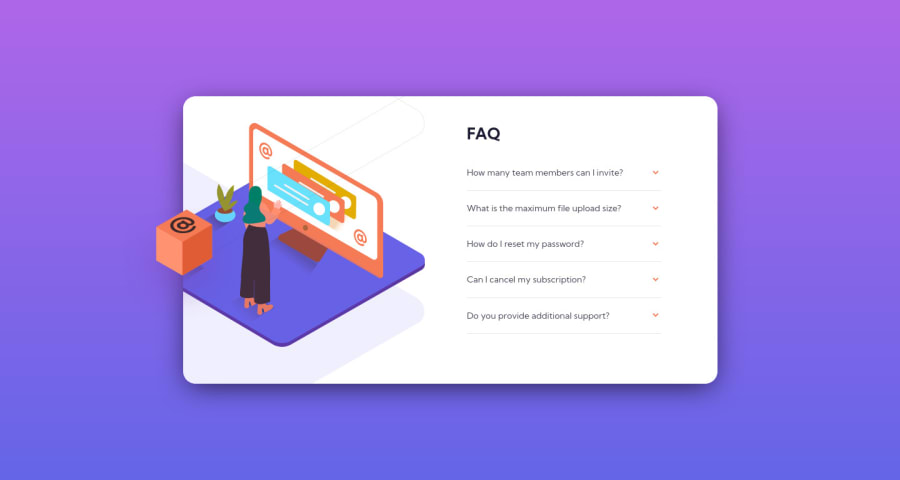
Design comparison
Solution retrospective
It's working as intended, but any feedback would be great, especially when it comes to how to make the orange arrow turn up when click and how to place a background image on a background image, they are kind of at the same level and don't really know how to change it. Thank you.
Community feedback
- @Julr09Posted over 3 years ago
Hey, thank you so much, definitely will put in practice what you said and give a try to BEM
0 - @osoriodevPosted over 3 years ago
Hello.
For the arrow you can use a
transformproperty, specificallyrotate. For example,transform: rotate(180deg)I see that you set the illustration as the background, it is not necessary, instead it is better to use the
picturetag. With this HTML tag you can display different images depending on the viewport and include the mobile illustration and the desktop illustration.Last but not least, I suggest you use a CSS methodology like BEM and semantic HTML and try not to use too many
divtags.I hope I've helped.
0
Please log in to post a comment
Log in with GitHubJoin our Discord community
Join thousands of Frontend Mentor community members taking the challenges, sharing resources, helping each other, and chatting about all things front-end!
Join our Discord
