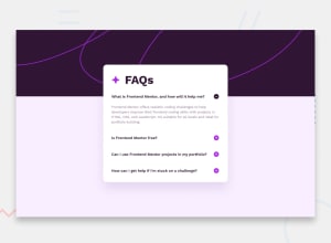
Design comparison
SolutionDesign
Solution retrospective
What are you most proud of, and what would you do differently next time?
The thing Im most proud of in this project is the way I handled the Javascript, although it was simple but I think I came up with just the right solution for this challenge.
What challenges did you encounter, and how did you overcome them?The hardest part for me was styling this one ,especially the background image ,took me awhile to get it right.
What specific areas of your project would you like help with?I would like an overview of my design,I think its still got room for getting better.
Community feedback
Please log in to post a comment
Log in with GitHubJoin our Discord community
Join thousands of Frontend Mentor community members taking the challenges, sharing resources, helping each other, and chatting about all things front-end!
Join our Discord
