Design comparison
Solution retrospective
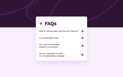
I'm most proud of completing the challenge of not using JS for the solution. This was made completely in Astro components with no (or as little as possible) JS footprint.
What challenges did you encounter, and how did you overcome them?Had some troubles with fluid typography as the library wasn't able to recognize arbitrary Tailwind values, just having to add those styles needed in the tailwind config and everything worked again.
Community feedback
- @law973Posted about 2 months ago
Hey! I think your solution is great overall, with the box shadow in particular standing out to me (mine wasn't that smooth).
A couple of quibbles:
- The challenge does mention being able to "see hover and focus states for all interactive elements on the page", so I would use the
:focus
pseudo-class to make the summary texts turn pink when they are selected. - For some reason, the file provided for this challenge has the words "Frontend Mentor" inserted into the last summary question, which doesn't correspond with the design preview that they want people to try and match. I'd remove those words so that the last question can fit on a single line in the desktop view, which matches the requested design (and arguably looks better).
- There is a minor typo in the page title.
- I think it'd be slick if the mobile background image and the desktop background image had the same height when switching from one to the other (but that's more personal preference and not an issue really).
The sizing, spacing, and responsiveness are on point, so all in all I think it's pretty nice. Keep up the good work!
...
(This comment got kind of long. I guess you could say...)
Marked as helpful1@hikawiPosted about 2 months ago@law973 Hello, I guess my brain was broken for that funny typo and you really toppled me over with this super detailed feedback. I'll take time to check and launch the fixes soon and the solution can then be smashing.
1 - The challenge does mention being able to "see hover and focus states for all interactive elements on the page", so I would use the
- @wendyhamelPosted about 2 months ago
Hi! Great solution to this challenge!
Your solution is very much like the design and your code is very readable. I had to look hard to find anything to comment on. 🙂
Nice to see you use the details / summary HTML solution.
Accessible, pure HTML. Great.
You could consider putting the elements in a list, to let users (screenreaders) know it is a list of questions grouped together.
I never worked with Astro, so I can't comment on that.
Happy Coding!
1
Please log in to post a comment
Log in with GitHubJoin our Discord community
Join thousands of Frontend Mentor community members taking the challenges, sharing resources, helping each other, and chatting about all things front-end!
Join our Discord