Solution retrospective
👾 Hello, Frontend Mentor Community,
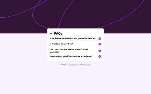
This is my solution for the Single price grid component
Used Prettier code formatter to ensure unified code format ⚙️ Layout was built responsive via mobile first workflow approach 📲 Had a lots of fun while building this challenge ! 🤠 Feel free to leave any feedback and help me to improve my solution 💡 Thoughts : I faced little issue in terms of using pre downloaded fonts. But I overcome this situation and learnt new things on the way.
👨🔬 Follow me in my journey to finish all newbie challenges to explore solutions with custom features and tweaks
Ill be happy to hear any feedback and advice !
Please log in to post a comment
Log in with GitHubCommunity feedback
No feedback yet. Be the first to give feedback on Alok Suman's solution.
Join our Discord community
Join thousands of Frontend Mentor community members taking the challenges, sharing resources, helping each other, and chatting about all things front-end!
Join our Discord