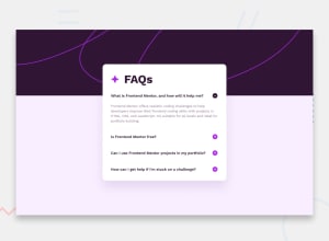
Design comparison
SolutionDesign
Solution retrospective
What are you most proud of, and what would you do differently next time?
HTML first, CSS second
What challenges did you encounter, and how did you overcome them?Dealing with ``Tag to implement FAQ accordion
Click Me!
Now im visible!
Can somebody check for:
- Right use of px, rem, em and %
- HTML semantic (nest inside )
- Handling images, making images responsive (especially my icon plus and icon minus images look wierd on small devices), dealing with background pattern
Community feedback
Please log in to post a comment
Log in with GitHubJoin our Discord community
Join thousands of Frontend Mentor community members taking the challenges, sharing resources, helping each other, and chatting about all things front-end!
Join our Discord
