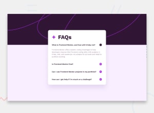
Design comparison
Solution retrospective
I think the organization of my components in this project is pretty good, and I'm proud of that.
I had to add my own JS for the details elements to only open one item at a time on FireFox, since it doesn't support the "name" attribute on details elements it seems. I'm sure the JS I used makes the page less accessible, and I'd like to know how to rectify that.
What challenges did you encounter, and how did you overcome them?The background image was tricky until I realized two different ones were provided. Once I realized that it was pretty easy to use a media query to switch between the two background images.
If I weren't as experienced, I'm sure using pseudo-elements for the FAQs heading and the buttons would have been a bit tricky for some.
What specific areas of your project would you like help with?I'd like to know how to manage accessibility when JS is involved and showing/hiding content on screen when users click things.
Join our Discord community
Join thousands of Frontend Mentor community members taking the challenges, sharing resources, helping each other, and chatting about all things front-end!
Join our Discord
