Design comparison
Solution retrospective
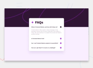
This project was a little strange for me. I originally picked it up as my first Frontend Mentor project, and got the functionality down but had several problems with styling the page. Going from desktop to mobile caused problems with scaling, the background image was not doing what I wanted it to and I didn't know how to fix it. I came back to this project about two weeks later after I'd done several other projects and felt I could handle it a lot better. Unfortunately, I was not able to use React states in an efficient way, and I went with the same functionality I had written previously, which is a bit messy. I'm not entirely sure the accordian works as it should from the design pictures, but I don't know how else I would do it. If anyone has any suggestions on a different kind of functionality, please let me know!
Community feedback
Please log in to post a comment
Log in with GitHubJoin our Discord community
Join thousands of Frontend Mentor community members taking the challenges, sharing resources, helping each other, and chatting about all things front-end!
Join our Discord
