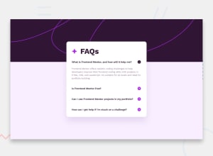
Design comparison
Solution retrospective
Sharing this project and completing is project in about 90 mins
What challenges did you encounter, and how did you overcome them?I didn't experience any troubles
What specific areas of your project would you like help with?Only CSS pixel perfection
Community feedback
- @Mateogr03Posted 7 months ago
-
Semantic HTML: The solution uses some semantic HTML elements, but it could benefit from further use of tags like
<header>,<section>, or<main>for improved structure. -
Accessibility: The design is fairly accessible, but improvements could include adding aria labels for better screen reader support, especially for interactive elements like buttons.
-
Responsive Design: The layout appears well-optimized for various screen sizes, maintaining usability and readability across devices.
-
Code Quality: The code structure is clear, but without viewing the actual code, I can't fully assess readability or reusability.
-
Design Consistency: The solution seems to align well with typical minimalist design patterns, keeping it close to the expected design.
0 -
Please log in to post a comment
Log in with GitHubJoin our Discord community
Join thousands of Frontend Mentor community members taking the challenges, sharing resources, helping each other, and chatting about all things front-end!
Join our Discord
