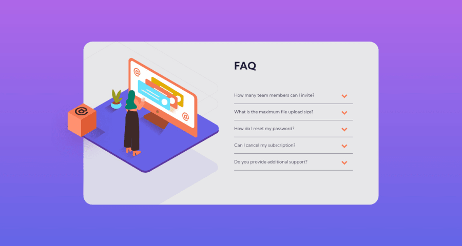
Design comparison
Community feedback
- @romila2003Posted over 2 years ago
Hi David,
Congratulations 🎉 for completing this challenge, your FAQ component looks great, and it is great that you used flex to center the card. There are some issues/suggestions I want to address:
- It is best practice to wrap the main content within the
maintag which would ensure that your content is wrapped within the correct landmarks e.g.<main class="container"></main> - To fix the
backgroundissue, you can change the value ofheightto100vhso that it covers everything. Also, it is not good to give thebodytag, a fixedwidthproperty such as365pxor1440pxas this will affect the inner content as well. - I noticed that you took a desktop-first approach however I would strongly encourage you to use the mobile-first approach as it will help with responsiveness and rearranging/changing elements within your body. Also, it is best practice to do so.
- In the
sectiontag, you need to use at least 1 header (any betweenh2toh6) therefore, you should not nest yourimgtags within this semantic. You could use thepicturetag instead. - Regarding the functionality of your JS, it works however when you click on the same arrow again after it has already been clicked, the Q and A won't close.
Overall, great work and project and wish you the best for your future projects so keep coding 👍.
0@cutch14Posted over 2 years ago@romila2003
Hi Romila, thanks for your suggestions! I have updated the functionality so now clicking an already open Q&A closes it.
1 - It is best practice to wrap the main content within the
Please log in to post a comment
Log in with GitHubJoin our Discord community
Join thousands of Frontend Mentor community members taking the challenges, sharing resources, helping each other, and chatting about all things front-end!
Join our Discord
