

Design comparison
SolutionDesign

Solution retrospective
-
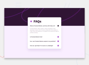
Found it hard to manage the card for different screen sizes and make it responsive. Even now its not responsive.
-
Even though the card is made flex, it is not responding for lower resolution sizes.
Community feedback
- @ali007-depugPosted 11 months ago
use clamp function css tk make it responsive read articles about it
0 - @accamamuhammadPosted 11 months ago
use: HTML: use the code in your html body
<div class="container"> <div class="box"></div> </div>CSS: use the code in your css file
.container { width: 100%; height: 100vh; display: flex; align-items: center; justify-content: center; }
This will place the box at the center but add width and height of for the box based on what you are trying to build.
0


Please log in to post a comment
Log in with GitHub
Join our Discord community
Join thousands of Frontend Mentor community members taking the challenges, sharing resources, helping each other, and chatting about all things front-end!
Join our Discord