
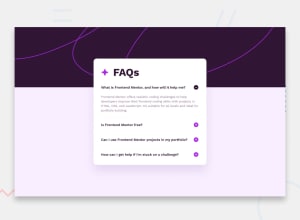
Design comparison
SolutionDesign

Community feedback
- @percydocomoPosted about 2 months ago
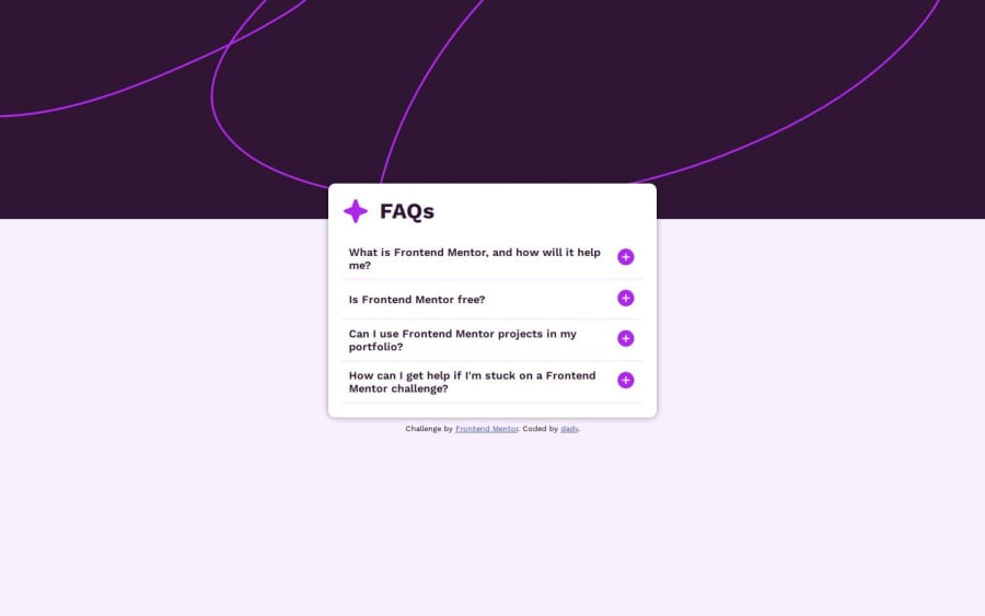
The HTML is semantically well written and the code is readable. The page is keyboard accessible too. The card div from the original project is not centered vertically and horizontally so your solution's layout looks a bit different from it. The size of the card div is also different.
Marked as helpful0

Please log in to post a comment
Log in with GitHubJoin our Discord community
Join thousands of Frontend Mentor community members taking the challenges, sharing resources, helping each other, and chatting about all things front-end!
Join our Discord