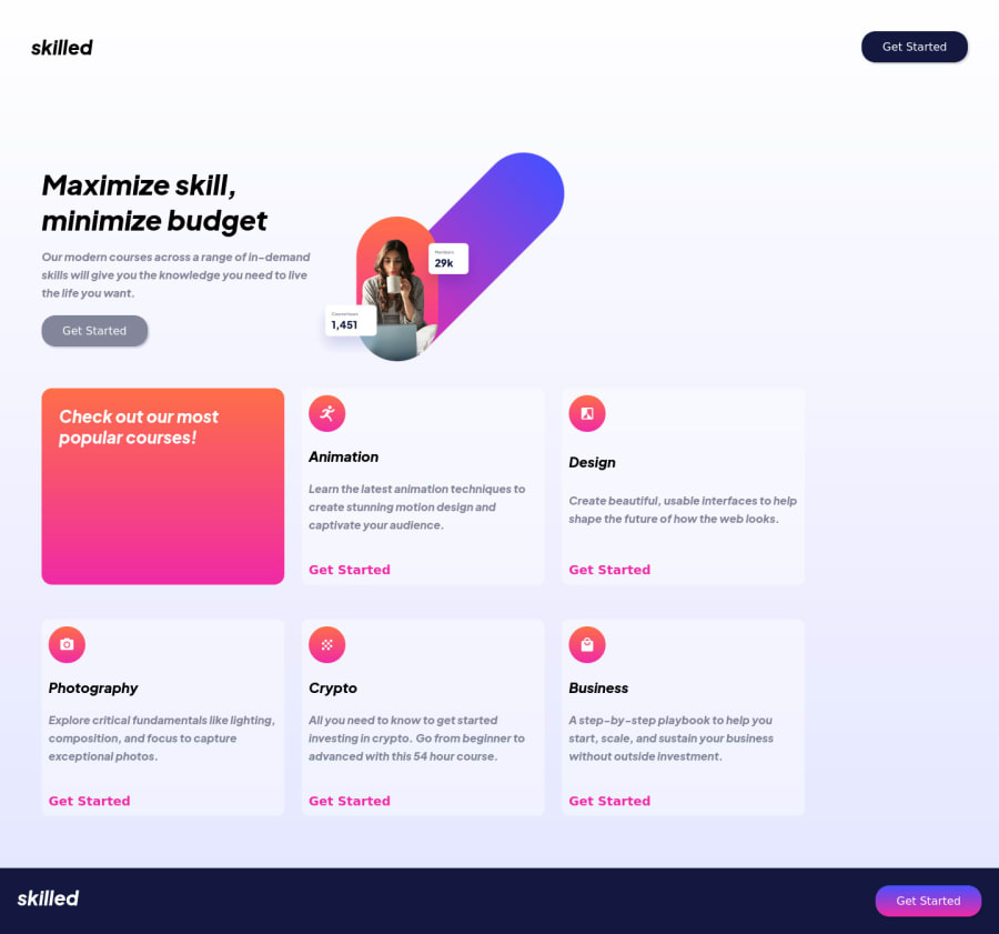
Design comparison
SolutionDesign
Solution retrospective
Hello! Hope you are doing fine.
I have some issues as you can see in this project.
- The small icons in the cards are inside the Div and in the figma project are kind of in the middle outsie, middel inside, how can i do that correctly?
2)The images are not big enough, is like the first section i add it something like a width and cant change it so still the same width
- seems that the site is not responsive at all even i added the breakpoints but when i go to inspect, is really bad. I start to enlarge and everything seems to be in the left side
Please give me all the advise possible to improve my project!
Thanks in advance
Community feedback
Please log in to post a comment
Log in with GitHubJoin our Discord community
Join thousands of Frontend Mentor community members taking the challenges, sharing resources, helping each other, and chatting about all things front-end!
Join our Discord
