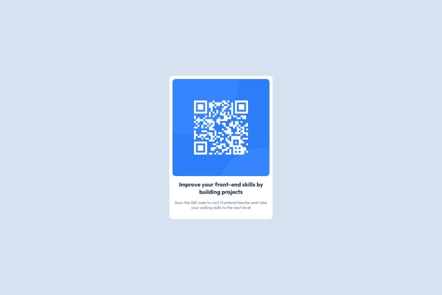
Eye-Catching QR Code Design: A Responsive HTML & CSS Showcase
Design comparison
Solution retrospective
I’m most proud of the clean, responsive design of the QR code component. The use of modern CSS techniques ensures the component looks great on all devices, and the integration of Google Fonts enhances the visual appeal.
Next time, I would explore incorporating interactive features, like hover effects or animations, to make the QR code more engaging. Additionally, I’d experiment with more advanced layout techniques to further optimize responsiveness across various screen sizes.
Community feedback
- @zmora2622Posted 8 months ago
The solution differs significantly from the design.
First of all, in the html code, I would suggest using the h1 tag instead of h3, and the main tag instead of the section (good practice). I would not operate on vh sizes for widths as they are problematic. I suggest setting: html { font-size: 62.5%; } , then the font-size for the whole page will be 10px, allowing easy use of rem instead of vh.
I suggest setting the colours as CSS variables, this makes it easier to change the colour scheme in larger projects.
The whole card would look better with more rounded corners and more room to breathe inside (padding).
The text to catch the eye should definitely be larger.
Marked as helpful1@ManoharDevangam07Posted 8 months ago@zmora2622 Hey i greatly appreciate your feedback, it really gave me some good insights
0 - @tomblack9452Posted 8 months ago
This design follows the design brief correctly in terms of colour styling, however the sizing of the QR code and the text is different to the initial design. This newer one looks more pronounced and 'straight to the point' in my opinion (if this description makes any sense) with the slightly differing sizes, but in the real world it depends on exactly what the client is aiming for whether they'll accept that or not. CSS could be moved to an external stylesheet as well but for a page this small, it's irrelevant really.
Great design and overall clean code too <3
Marked as helpful1@ManoharDevangam07Posted 8 months ago@tomblack9452 Hey Thankyou for the feedback, I will keep all the next css in external file in coming exercises, and will try to make the design accurate
1
Please log in to post a comment
Log in with GitHubJoin our Discord community
Join thousands of Frontend Mentor community members taking the challenges, sharing resources, helping each other, and chatting about all things front-end!
Join our Discord
