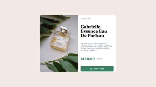
Submitted about 1 year agoA solution to the Product preview card component challenge
Experimenting with flexbox gap and clamp
@LouisVerch

Solution retrospective
What are you most proud of, and what would you do differently next time?
Quite proud of my implementation of clamp for extra responsiveness and use of rem, em and % measurements instead of px. Trying to implement good coding practices. Final design looks good and is responsive with all devices. Mobile-first approach and good variables definitions. Experimented with the picture tag as well.
What challenges did you encounter, and how did you overcome them?I struggled with the sizing of my text after the image breakpoint. I experimented with gap percentages, max-width and clamp and finally ended up on something good. (It took me 2 good hours though)
What specific areas of your project would you like help with?- I still have some issues at the image breakpoint for about 10px. Probably due to my gap % and max-width but I decided to not chase the pixel perfect dream. Any insight on this issue would be greatly appreciated.
Code
Loading...
Please log in to post a comment
Log in with GitHubCommunity feedback
No feedback yet. Be the first to give feedback on LouisVerch's solution.
Join our Discord community
Join thousands of Frontend Mentor community members taking the challenges, sharing resources, helping each other, and chatting about all things front-end!
Join our Discord